2026 Wedding Colors That Will Wow Your Guests
If you are planning a wedding for 2026, you are likely already sensing a shift in the atmosphere. While timeless elegance never fades, the upcoming wedding season is championing a new kind of bravery in design. We are seeing couples trade the expected for the extraordinary, embracing color stories that are rich, tactile, and deeply expressive.
Choosing your color palette is one of the first design decisions you will make, and it anchors every other choice—from the font on your save-the-dates to the shade of the velvet on your lounge chairs. For 2026, the trends are distinct. We are seeing a return to nature’s deepest hues, a celebration of warmth, and shocking pops of electric vibrancy that turn venues into modern art installations.
Whether you are dreaming of a moody, romantic vibe or a clean, monochromatic stunner, these four trending Pantone colors are set to define the look of luxury in 2026. Let’s explore how to bring these shades to life in a way that feels fresh, fun, and unmistakably you.
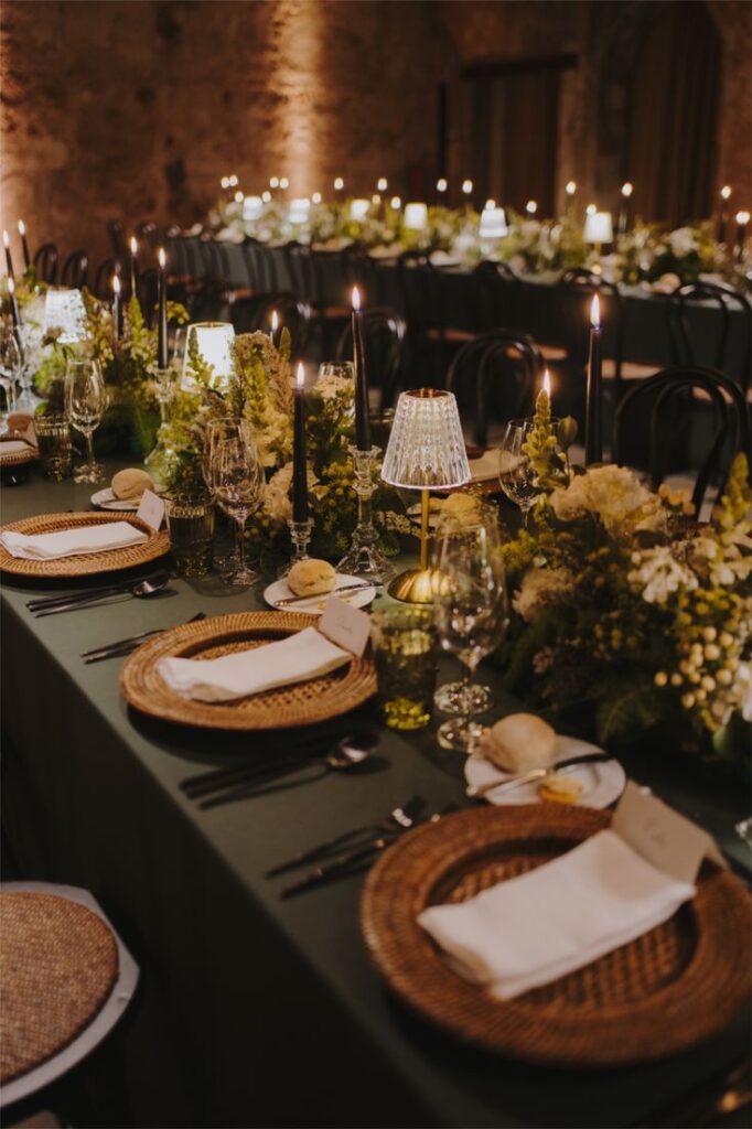
Pantone Eden: The Evolution of Green
Green has been a wedding staple for years, usually in the form of eucalyptus garlands or sage bridesmaid dresses. But in 2026, green grows up. Enter Pantone Eden (19-6050 TCX), a profound, forest-floor green that feels grounded yet opulent. This isn’t just a color found in your bouquet stems; it is a main character energy that transforms spaces into enchanted, elevated sanctuaries.

Setting the Scene with Texture
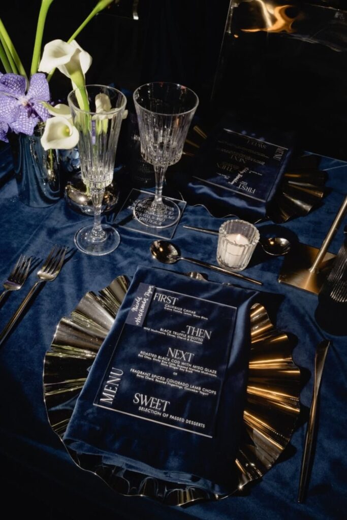
The key to mastering Eden is texture. Because the color is so dark and absorbing, it craves materials that catch the light or invite touch. Envision a ceremony backdrop draped in heavy lush velvet in this deep shade, framing you in richness as you say your vows.
For the reception, you can consider moving away from standard white china. We are loving the resurgence of patterned dinnerware featuring botanical prints in deep greens. Layer these atop hunter-green table linens for a moody, monochromatic look, or let them pop against dark wood tables for a “dinner in the woods” vibe.
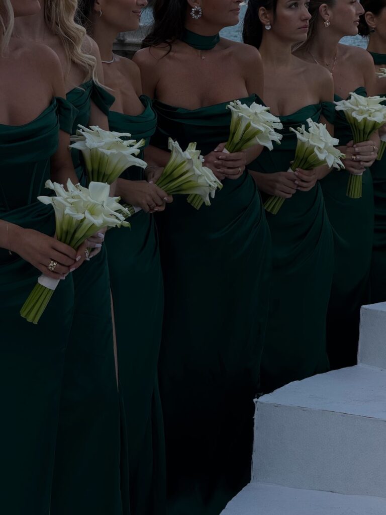
Attire That Enchants
For the bridal party, Eden offers a universally flattering shade that looks expensive on everyone. Think floor-length velvet gowns for bridesmaids, perhaps with high slits to keep the look modern.
But let’s talk about the bride. If you aren’t ready to don a green dress, channel the trend through accessories. A pair of Eden green velvet slingbacks peeking out from under your gown adds a secret layer of style. Pair this with emerald jewelry—perhaps a vintage cocktail ring—to tie the look together.
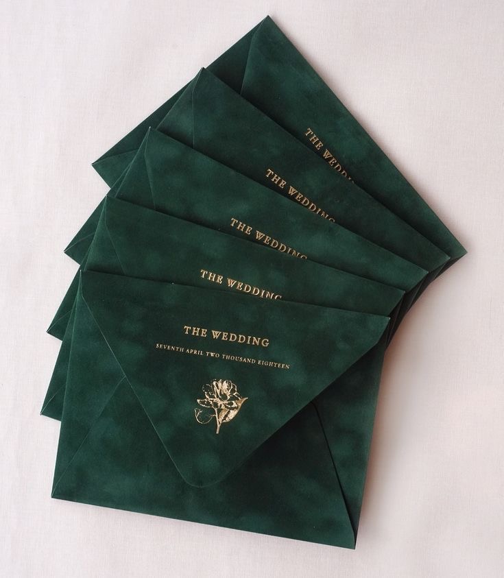
The Devil in the Details
Don’t stop at the decor. Carry this theme into your stationery with envelopes in deep Eden green, embossed with gold foil. And for the cake? We are seeing a move toward “nature-goth” aesthetics—intricate sugar work featuring beetles, scarabs, or ferns painted in deep greens and gold, turning your dessert into a sculptural masterpiece.
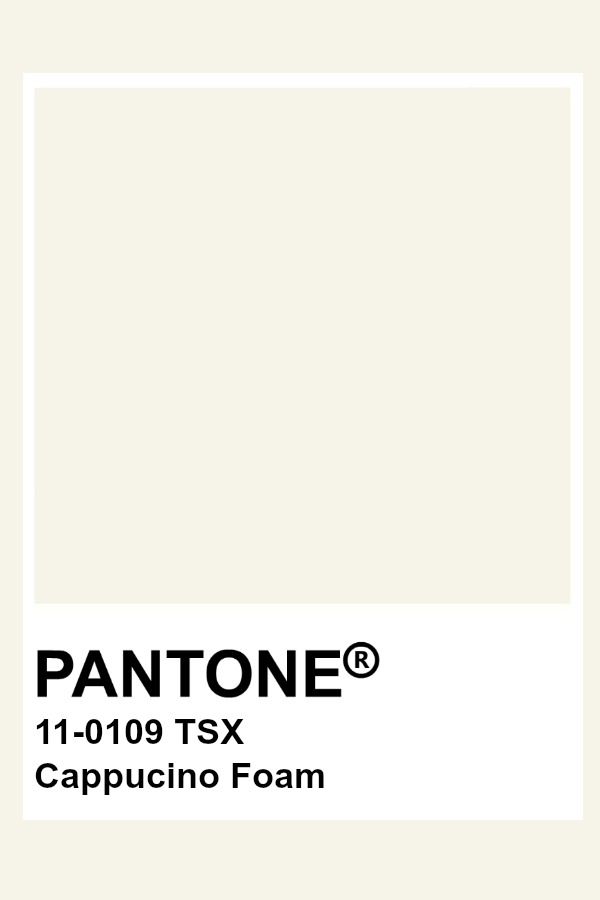
Pantone Cappuccino Foam: The New Face of Quiet Luxury
If color isn’t your calling, 2026 has a sophisticated answer for you. Pantone Cappuccino Foam (110109) is the antidote to the stark, clinical whites of the past. It is soft, creamy, and undeniably expensive-looking. This is “Quiet Luxury” in color form—a palette that whispers rather than shouts, relying on light and shadow to create drama.
Layering Shades of Cream
The mistake many couples make with neutrals is flatness. To make Cappuccino Foam work, you must layer. You aren’t just using one shade of beige; you are mixing cream, ivory, champagne, and foam.

Envision a reception space defined by billowing fabric. We aren’t talking about simple curtains; we mean ceiling installations of sheer, cappuccino-colored voile draped with fairy lights to create an ethereal, cloud-like canopy. This softens the acoustics and makes the entire room glow with warmth.
Organic Elegance in Florals
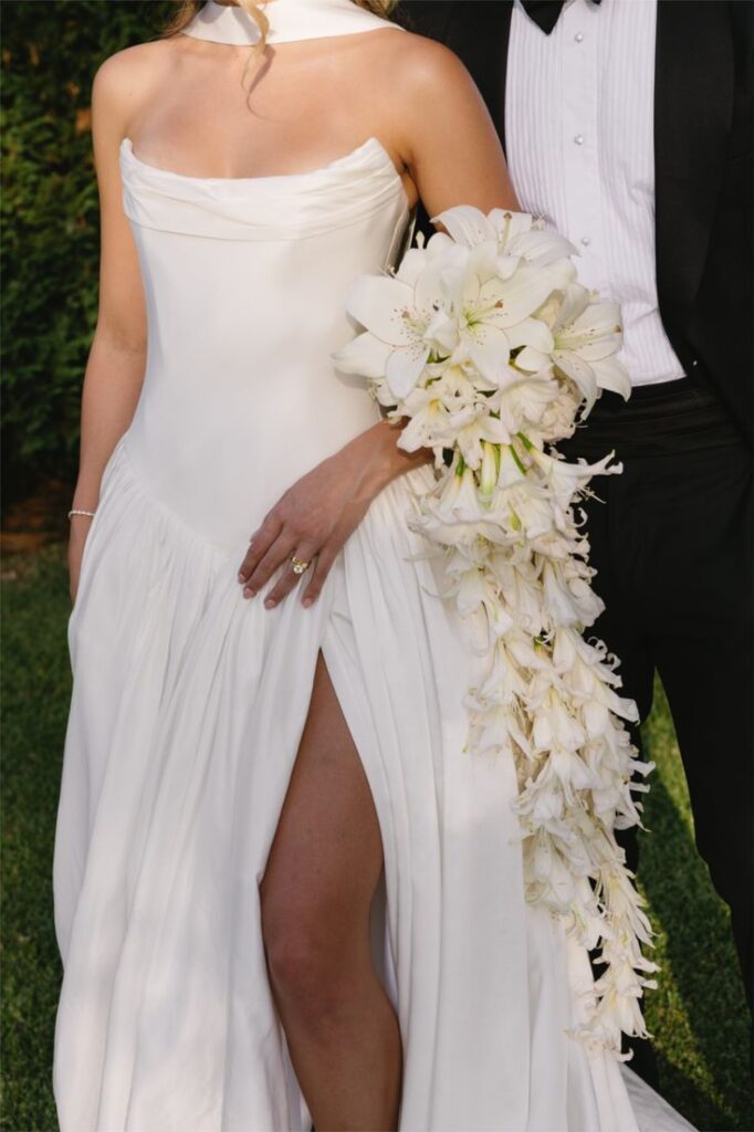
For florals, this trend celebrates structure and shape over color. Monofloral arrangements are huge here. A bouquet of thirty white calla lilies, stems exposed, looks architectural and chic. Alternatively, masses of white tulips or ranunculus, which have a natural creaminess to them, add softness without breaking the monochrome palette.
The “Undone” Look

This color trend pairs beautifully with a slightly more relaxed, European sensibility. Use wooden cross-back chairs with long, flowing fabric ties in Cappuccino Foam that pool on the grass or floor. In fashion, this translates to the silk slip dress—effortless, glowing, and minimalist. For the groom, a linen suit in a warm oatmeal shade captures this laid-back yet luxe aesthetic perfectly.
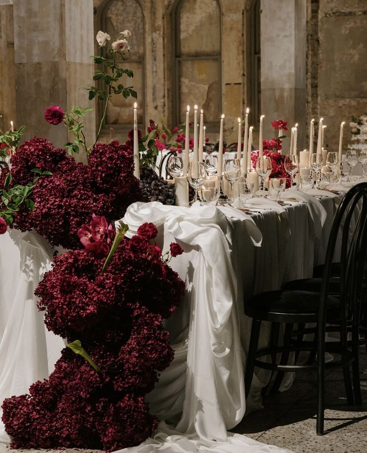
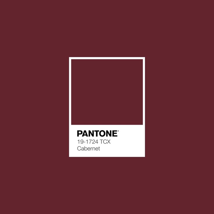
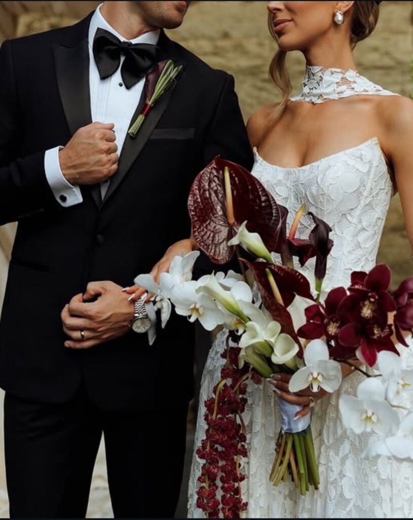
Pantone Cabernet: A Toast to Romance
Red is back, but it has matured. Pantone Cabernet (19-1724 TCX) is a rich, heady burgundy that evokes candlelit dinners, fine wine, and passionate romance. It moves away from the bright “fire engine” reds and settles into something darker, moodier, and infinitely more romantic.
Dramatic Dining
Cabernet is the perfect shade for a dinner-focused reception. It stimulates the appetite and feels incredibly cozy. Dress your tables in crisp white cloths to let the centerpieces shine, or go bold with black tables and Cabernet runners.
The real showstopper here is the lighting. Cabernet demands candlelight. We are talking hundreds of tall, tapered candles in silver or brass holders, interspersed with low, sprawling arrangements of deep red roses, dahlias, and amaranthus. The glow of the fire against the deep red flowers creates an intimacy that is unmatched.
A Feast for the Senses
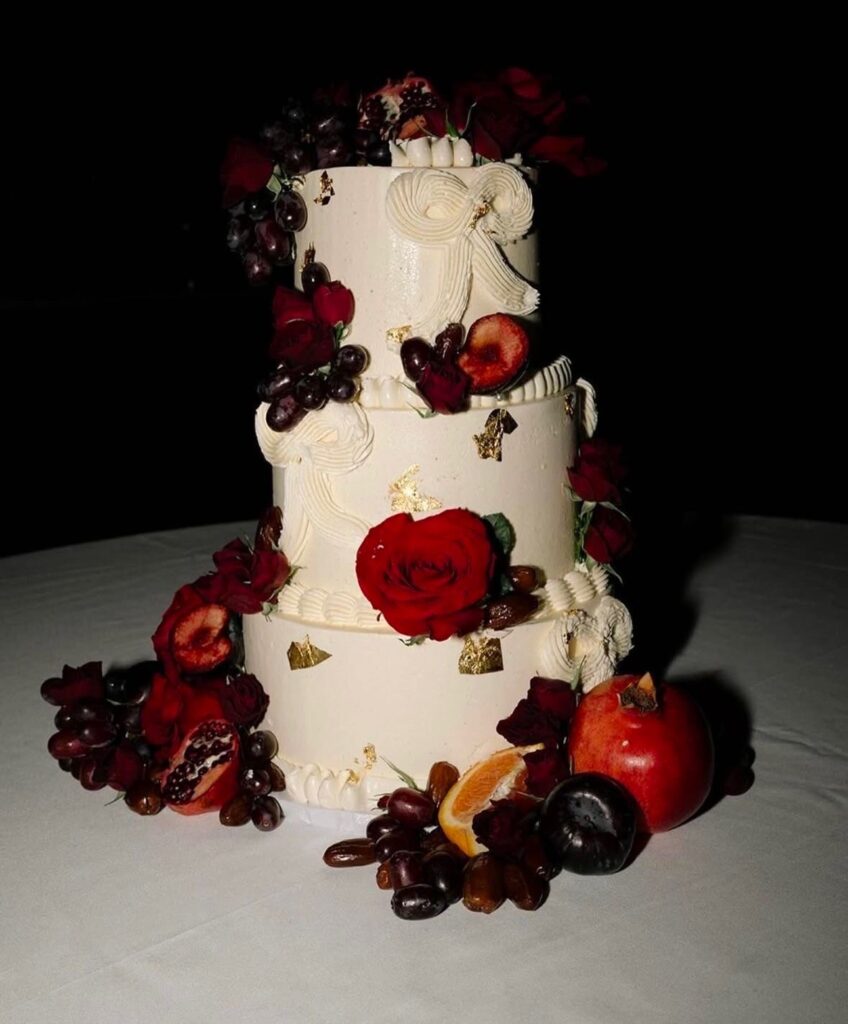

This trend extends beautifully into the culinary experience. Your cake becomes a canvas for abundance. Forget smooth fondant; think buttercream adorned with cascading fresh fruit—figs, blackberries, raspberries, and dark red grapes. It feels medieval and bountiful.
Bold Fashion Choices
Cabernet allows for striking fashion moments. A bride might swap a traditional white bouquet for a dense clutch of black baccara roses. For the reception change, a sleek, satin gown in deep Cabernet is a power move that ensures all eyes remain on you. It’s elegant, sexy, and perfect for the dance floor.
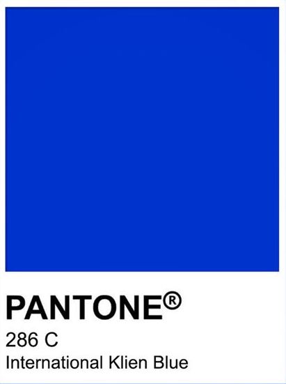
Pantone International Klein Blue: The Modernist’s Dream
For the couple who views their wedding as a piece of performance art, Pantone International Klein Blue (286 C) is the trend to watch. This vivid, electric blue is intense and unapologetic. It creates a visual shock that wakes up the senses and looks incredible in photography.
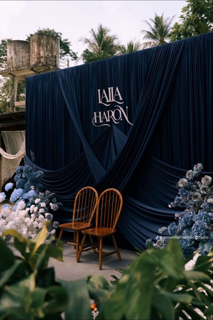
Color-Drenching

The 2026 approach to this color is “all or nothing.” We are seeing a trend called color-drenching, where entire sections of a venue are bathed in this hue. Imagine a photo moment where the floor, the walls, and the plinths are all painted in matching Klein Blue. It creates an infinity effect that is thoroughly modern.
Sculptural Florals and Decor
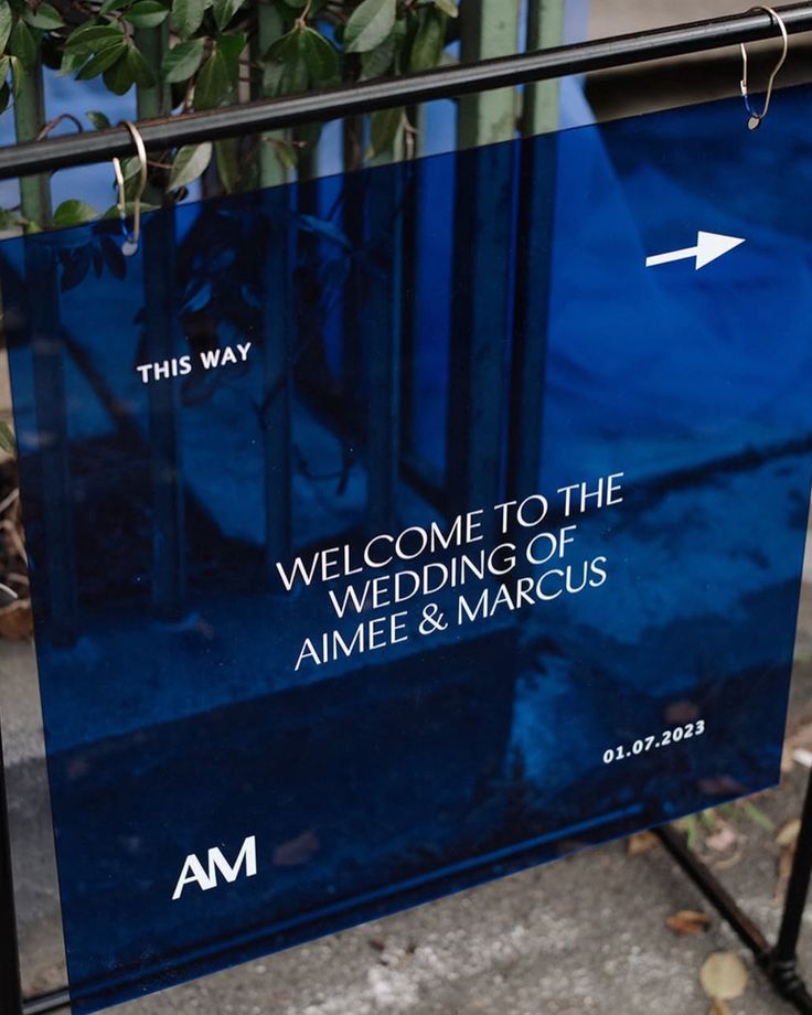
This color pairs exceptionally well with acrylic and glass. Use translucent blue ghost chairs or bold, blue acrylic signage for your seating charts and welcome signs.
For florals, nature doesn’t produce this color often, so you have to get creative. Hydrangeas can get close, but many designers are using dyed florals or painted dried elements (like palm spears or baby’s breath) to achieve that electric vibration. Pair these with stark white vases or sculptural ceramic pedestals to heighten the contrast.
The Statement Element
If painting the walls blue isn’t an option, use this color for your “wow” factor. A custom dance floor wrapped in a Klein Blue vinyl with white typography makes a massive impact. Or, consider blue glassware for your table settings—it turns water and wine into liquid sapphires, adding a jewel-tone sparkle to the dinner service.
Curating Your 2026 Palette
The beauty of the 2026 wedding trends lies in their conviction. Whether you choose the deep serenity of Eden, the soft luxury of Cappuccino Foam, the passion of Cabernet, or the electric energy of Klein Blue, the goal is to commit fully.
These colors are not just backgrounds; they are ingredients in the experience you are building for your guests. They set the mood, direct the eye, and tell a story about who you are as a couple. So, as you begin your planning journey, don’t be afraid to pick a lane and drive fast. The most memorable weddings are the ones that aren’t afraid to be bold.
Which hue speaks to your love story? The future looks bright—and beautifully colored.

Be the first to comment